LIFE CHURCH – REBRAND
Life saw themselves as being more like a media company in the sense that it was multi facetted and dynamic. The core idea behind the brand mark was the sum of parts coming together to form something greater than the individual. A sense of belonging and support. The brand mark was Initially presented using triangle forms which have strong symbolic meanings in both the Christian world and beyond. If you put pressure on any of its sides, it is impossible to break, its foundations are strong. However through the refines process Life wanted to explore making the connection to the church more obvious which is how we landed on the cross symbol.
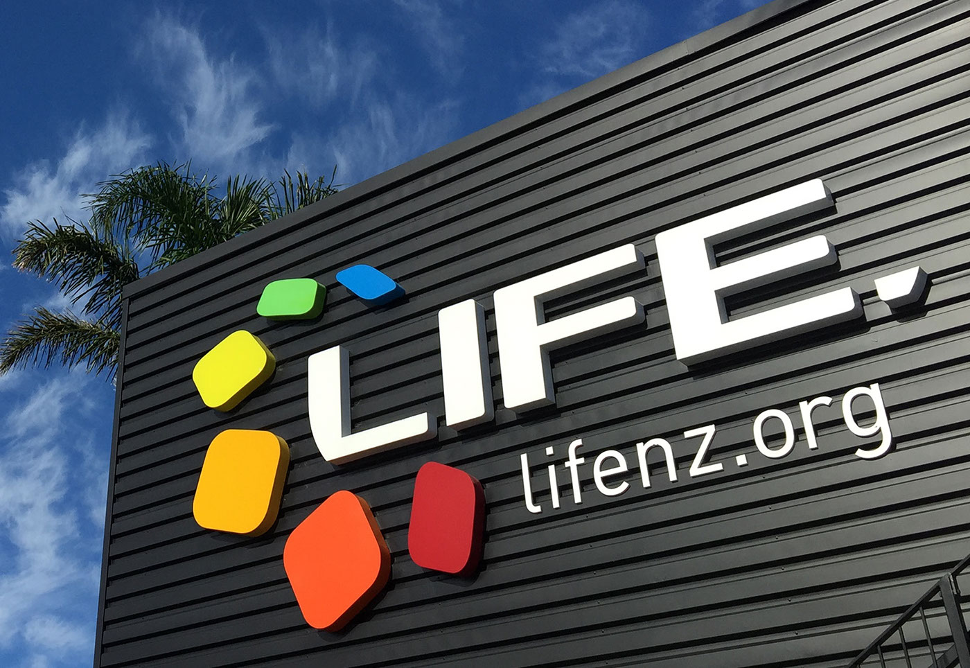
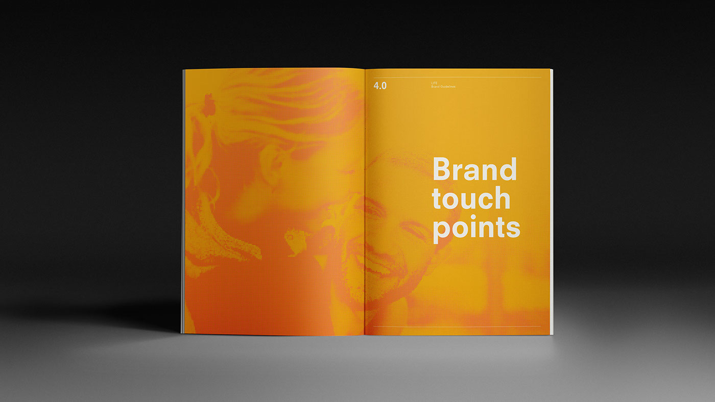
The brand mark was purposely kept simple, predominately using white, as this enabled it to work across a huge array of diverse touch-points, which the company produces using their internal design teams (graphic, digital, moving image).
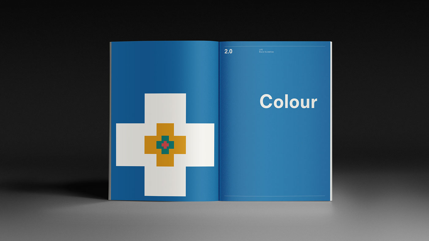
The brand identity is built around four key colours, each representative of the four focuses and the crosses are used at various sizes to give it a dynamic look & feel.
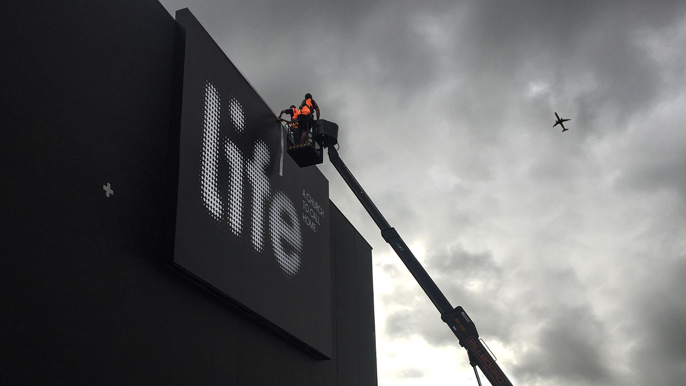
Our deliverables for this project were brand mark, signage, guidelines, stationery, animation and launch video.

Before


contact us at andrew@triedandtruedesign.co.nz or prue@triedandtruedesign.co.nz
see us at www.triedandtruedesign.co.nz

